Chapter 2 Review – Basic R Tables and Charts
Jerzy Letkowski, Ph.D.
- 1 Getting a Dataset from Excel to R
- 2 Drawing a Pie Chart
- 3 Getting a Frequency Distribution for a Qualitative Dataset
- 4 Getting a Frequency Distribution for a Quantitative Dataset
- 5 Drawing a Histogram
- 6 Drawing a Scatter Diagram
- 7 Drawing a Polygon
- 8 Drawing an Ogive
- 9 Printing Stem & Leaf
Notice the following convention in this instruction which consists of narrative paragraphs, R statements, R output, and images.
Each line that starts with a "greater than" character (>) is an R statement. This character is referred to as the R prompt. You can copy the statement in this document and paste it to the R window or you can type it in the window. Do not type the prompt. It is shown in the R console, indicating where the next statement can be entered.
Occasionally I will develop and run some R applications, using Jupyter Notebook, a programming environment for Python or R, provided by Anaconda. There is no R prompt shown in Jupyter Notebook. Nonetheless, my instruction will show it in order to clearly identify R [executables] statements.
I will try to show the R prompt in green (>). Notice that some R statements will need more than one line to be fully displayed.
1 Getting a Dataset from Excel to R
The datasets that accompany the book are provided as Excel workbooks. R can read data directly from Excel files or via Clipboard.
This instruction shows how to do it, using the Clipboard (Copy/Paste).
Step 1. Launch R.
Step 2. Type or copy/paste the following statement (do not press the Enter key):
> x = read.table(file="clipboard", sep ="\t", header=TRUE)
Note: This statement will read data separated with a tab (the Excel's default delimiter) into an R data table (named as x), including the header.
Step 3. Open the Excel's dataset (workbook).
Step 4. Select the table you want to send to R, and press the Copy button (or Ctrl+C).
Step 5. Switch back to R and press the Enter key (while the cursor is still flashing at the end of the above R statement). If the statement has been entered prior to copying the dataset in Excel, just press the UP Arrow key (to recall the statement) and then press Enter.
Let's apply this procedure to document Marital_Status shown on the book's page 25. The dataset is on sheet Marital_Status in workbook Chapter2.xlsx. It consists of three columns: Marital Status (categories: Married, Single, Divorced, and Widowed), 1960 proportions, and 2010 proportions of the marital status categories. This workbook is included in the lecture notes for Chapter 2 on Kodiak.
Step 1. Launch R and press Crtl + L (to clear the lines).
Step 2. Type or copy/paste the following statement (do not press the Enter key):
> x = read.table(file="clipboard", sep ="\t", header=TRUE)
Note: Make sure that the cursor it blinking at the end of the line. If you accidently entered this statement, press the UP Arrow key, for the cursor to get back at the end of the line.
Step 3. Open the Excel's dataset Chapter2.xlsx.
Step 4. Open worksheet Marital_Status, select range A1:C5, and click the Copy button (or press Ctrl+C).
Note: Now, the table content should be stored on the system's Clipboard.
Step 4. Switch back to R and press the Enter key (while the cursor is flashing at the end of the read.table statement).
To print the table on the screen, enter its name (x).
> x
Marital.Status X1960 X2010
1 Married 0.71 0.52
2 Single 0.15 0.28
3 Divorced 0.05 0.14
4 Widowed 0.09 0.06
Notice the differences between the R and Excel headers.
This end section "1 Getting a Dataset from Excel to R ".
While in R, apply the following statement (based on the example on page 25). Enter the following statements:
> pie(x$X1960, labels=x$Marital.Status, main='Marital Status, 1960')
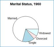
This pie shows the slices sized according to the proportions stored in column X1960. Since the proportions (probabilities) add up to 1. The entire circle represents the sum of the proportions (1) and the slices have angles equal to the fractions of 360° (full circle). Since there are 71% Married individuals (0.71) the angle of the corresponding slide is 0.71*360.
The original statement (shown in the book) is:
> pie(Marital_Status$'1960', labels=Marital_Status$'Marital Status', main="Marital Status, 1960")
This statement assumed that the R table name was Marital_Status (instaed of x). Also notice slightly different column names and 'Marital Status' vs. Marital.Status and '1960' vs. X1960.
Note: Ideally, all names (as identifiers) should not have spaces. When R was transferring data from the Clipboard, is encountered name 'Marital Status' with a space between words ''Marital' and 'Status '. Excel is OK with such a name, residing in the table header. R replaced the space with a period. It also prefixed the names of the second and third columns with letter X. Originally, in Excel the names are 1960 and 2010. R likes names to begin with a letter or an underscore, not with a number. This is why, while transferring data from the Clipboard, R added letter X in front of Excel's column names 1960 and 2010. By the way, it is possible to change column names in R, using the colname() function. Why don't we try the following statement?
> colnames(x) = c('marital_status','year1960','year2010')
The pie() function can now be rewritten as:
> pie(x$year1960, labels=x$marital_status, main='Marital Status, 1960')
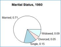
Let's enhance the pie chart a little by adding the percentages (proportions) from column year1960 to the labels shown in column marital_status. To this end we will use a paste() function.
> lbls = paste(x$marital_status, x$year1960, sep=", ")
This assignment statement combines the marital status labels with the year1960 proportions, separating them with a comma and one space. You can see the new labels by printing variable labels, using the cat() function:
> cat(lbls); cat('\n')
R shows this output:
"Married, 0.71" "Single, 0.15" "Divorced, 0.05" "Widowed, 0.09"
Note that the cat() function does not feed a line. This is why the second cat() function is used with the argument equal to the line feed character ('\n'). In R, as in many other programming languages, '\n' stands for line feed. The effect is the same as pressing the Enter (Return) key on the keyboard. You may have seen another, invisible character: tab defined in R as '\t'.
Let's now use our new labels to generate a pie chart:
> pie(x$year1960, labels=lbls, main='Marital Status, 1960')
Now, the chart also shows the proportions associated with each marital status.
How would do the same but with the proportions shown with the % format? For example, label 'Married, 0.71' is to be shown as ' Married, 71%'.
This end section "2 Drawing a Pie Chart".
3 Getting a Frequency Distribution for a Qualitative Dataset
In the above example, the frequency distribution has already been given. It showed the relative frequencies (proportions) for several categories of variable marital_status. (By the way, I recommend to create variable names made of many words by connecting the words with an underscore. Thus, for Marital Status, the variable name is marital_status.)
The following example shows how to create a frequency distribution from a [raw] sample. The sample represents preferred colors of tee-shirts among student of Colorful College (CC). The store manager at CC asked randomly encountered students for their preferred colors of the CC tee-shirts. The sample is stored as a flat text file named as colors.txt, having one color (one student response) per line. This file is contained in the lecture notes. These lecture notes are expected to be downloaded from lecture ch02_review folder of the Lecture forum, on Kodiak, to local file folder T:\bis221\lecture. Archive ch02_review.zip, when unzipped, will create folder ch02_review, extending folder T:\bis221\lecture. This the lecture notes files should be in folder with the full path equal to T:\bis221\lecture\ch02_review. The full file address of the "preferred colors" sample should be T:\bis221\lecture\ch02_review\colors.txt. This file will be loaded in an R data frame, named cp (for color preferences) as follows:
> src = 'T:/bis221/lecture/ch02_review/colors.txt'
> cp = read.table(file=src, header=TRUE)
Notice that the file argument of the read.table() function is now set to variable src that "knows" the name and location of the input file. Since the sample, loaded into the cp data frame, is long, let's show only a few beginning and ending elements:
> head(cp)
preferred_color
1 White
2 Gold
3 Azure
4 Pink
5 Black
6 Brown
> tail(cp)
preferred_color
675 Khaki
676 Crimson
677 Blue
678 Yellow
679 Black
680 Olive
If we show explicitly the column (preferred_color) of the table, R also will show the levels, indicating that this column is a factor. Let’s show just first five (1:5 )rows of the column:
> cp[1:5,'preferred_color']
[1] White Gold Azure Pink Black
24 Levels: Azure Beige Black Blue Brown Crimson Cyan Gold Gray Ivory Khaki Lime Magenta Maroon Olive Orange Pink Red Salmon ... Yellow
Let's now generate the frequency distribution (counts) of the colors:
> cp_frq_count = table(cp$preferred_color)
> cp_frq_count
Azure Beige Black Blue Brown Crimson Cyan Gold Gray Ivory Khaki Lime Magenta Maroon Olive Orange
26 16 17 29 52 17 44 44 3 30 52 65 11 19 34 44
Pink Red Salmon Silver Tan Violet White Yellow
24 9 3 9 10 51 45 26
The table() function did a great statistical job but the output format is not friendly. Let's convert this output to a data frame:
> cp_frq_distr = data.frame(cp_frq_count)
> cp_frq_distr
Var1 Freq
1 Azure 26
2 Beige 16
3 Black 17
4 Blue 29
5 Brown 52
6 Crimson 17
7 Cyan 44
8 Gold 44
9 Gray 3
10 Ivory 30
11 Khaki 52
12 Lime 65
13 Magenta 11
14 Maroon 19
15 Olive 34
16 Orange 44
17 Pink 24
18 Red 9
19 Salmon 3
20 Silver 9
21 Tan 10
22 Violet 51
23 White 45
24 Yellow 26
R named the columns as "Var1" and "Freq". Let's change it to "preferred_color" and "frequency":
> colnames(cp_frq_distr) = c("preferred_color", "frequency")
Show the top of the frame:
> head(cp_frq_distr)
preferred_color frequency
1 Azure 26
2 Beige 16
3 Black 17
4 Blue 29
5 Brown 52
6 Crimson 17
What is the total number (n) of the colors? We can find it out by adding all the frequencies or by getting the length of the original sample. Let's check this out:
> n = sum(cp_frq_distr$frequency)
> n
[1] 680
This is the same as:
> print( nrow(cp) )
[1] 680
We can now use the total and individual frequencies to get the proportions (relative frequencies).
> cp_frq_distr$proportion = cp_frq_distr$frequency / n
> cp_frq_distr
preferred_color frequency proportion
1 Azure 26 0.038235294
2 Beige 16 0.023529412
3 Black 17 0.025000000
4 Blue 29 0.042647059
5 Brown 52 0.076470588
6 Crimson 17 0.025000000
7 Cyan 44 0.064705882
8 Gold 44 0.064705882
9 Gray 3 0.004411765
10 Ivory 30 0.044117647
11 Khaki 52 0.076470588
12 Lime 65 0.095588235
13 Magenta 11 0.016176471
14 Maroon 19 0.027941176
15 Olive 34 0.050000000
16 Orange 44 0.064705882
17 Pink 24 0.035294118
18 Red 9 0.013235294
19 Salmon 3 0.004411765
20 Silver 9 0.013235294
21 Tan 10 0.014705882
22 Violet 51 0.075000000
23 White 45 0.066176471
24 Yellow 26 0.038235294
A final touch! Let's order the table by the frequency (same as by proportion) from the highest to the lowest frequency.
> cp_frq_distr = cp_frq_distr[order(-cp_frq_distr$frequency),]
> cp_frq_distr
preferred_color frequency proportion
12 Lime 65 0.095588235
5 Brown 52 0.076470588
11 Khaki 52 0.076470588
22 Violet 51 0.075000000
23 White 45 0.066176471
7 Cyan 44 0.064705882
8 Gold 44 0.064705882
16 Orange 44 0.064705882
15 Olive 34 0.050000000
10 Ivory 30 0.044117647
4 Blue 29 0.042647059
1 Azure 26 0.038235294
24 Yellow 26 0.038235294
17 Pink 24 0.035294118
14 Maroon 19 0.027941176
3 Black 17 0.025000000
6 Crimson 17 0.025000000
2 Beige 16 0.023529412
13 Magenta 11 0.016176471
21 Tan 10 0.014705882
18 Red 9 0.013235294
20 Silver 9 0.013235294
9 Gray 3 0.004411765
19 Salmon 3 0.004411765
The 5 most popular colors (top 5) are Lime, Brown, Khaki, Violet, and White. The mode of the original sample is color Lime. What is the probability of a randomly selected student to choose color Orange?
> cp_frq_distr[cp_frq_distr$preferred_color == 'Orange',3]
[1] 0.06470588
Same as:
> cp_frq_distr[cp_frq_distr$preferred_color == 'Orange','proportion']
[1] 0.06470588
This end section "3 Getting a Frequency Distribution for a Qualitative Dataset ".
4 Getting a Frequency Distribution for a Quantitative Dataset
4.1 Setting Up the Empirical Frequency Distribution
The richest way to summarize and visualize one-dimensional quantitative samples is by means of their empirical frequency distributions and histograms.
Getting a frequency distribution for a quantitative sample is a little more sophisticated. The frequency itself has also more features, but the most profound difference is that the categories are expressed is intervals, also referred to as class intervals or bins. The latter is use in Excel by the function dedicated to the same issue: =Frequency().
Let load this time a numeric sample, named as grd, from a file, grade.txt, also residing in the lecture notes folder:
> src = 'T:/bis221/lecture/ch02_review/grade.txt'
> grd = read.table(file=src, header=TRUE)
Let's show a few beginning and ending elements:
> head(grd)
Grade
1 56
2 74
3 60
4 54
5 68
6 72
> tail(grd)
Grade
59 73
60 82
61 74
62 61
63 81
64 52
Find out the range of data:
> rlim = range(grd)
> rlim
[1] 41 90
Find out the size (n) of data set (the number of rows in data frame grd:
> n = nrow(grd)
> n
[1] 64
Estimate the number (m) of class intervals:
> m = sqrt(n)
> m
[1] 8
Recall that a good "candidate" for the number of class intervals is a number close to the square root of the sample size. A similar estimate is used by the Histogram command of the Excel's Data Analysis tool. If we accept this estimate, then we can figure out the suggested width of the class interval.
> w = (rlim[2]-rlim[1])/ m
> w
[1] 6.125
Statisticians have some flexibility of setting the number of class intervals and the interval width. There are no strict guidelines but the class count is recommended to be between 5 and 20. For very large samples, the number can go above 20. A good evaluation criterion is the smoothness of the histogram generated from the empirical frequency distribution. Thus this whole procedure is an iterative process. Having setup the distribution, one should evaluate the quality of its histogram and, if necessary, go back and repeat it all for different settings. The suggested width is just a hint. The accepted width is usually slightly greater.
Let us select the width that is greater than the preliminary width
> w = 6.5
One missing piece of the setup is the left limit of the first class (a point where we anchor the intervals). It is supposed to be a number not too far from the sample minimum. From the range, we learn that the min = 41.
Set the left limit of the first class interval to 40.
> c0 = 40
We can now generate a series of limits that will define the 8 class intervals with interval width of 6.5. For example:
(40,46.5],(46.5,53],(53,59.5],(59.5,66],
(66,72.5],(72.5,79],(79,85.5],(85.5,92]
Notice that the next limit is equal to the previous one +
the width,
cj+1 = cj
+ w.
We can generate such a sequence in R as:
> bin = seq(c0, c0+m*w, by=w)
> bin
[1] 40.0 46.5 53.0 59.5 66.0 72.5 79.0 85.5 92.0
The nickname bin is frequently used to denote the limits of the class intervals. It used, for example, in Excel (see Data Analysis – Histogram).
We are now ready to generate the empirical frequency distribution.
Count the sample data in each class interval with the lower-limit exclusive and the upper limits inclusive.
> grd_cut = cut(grd$Grade, bin, right=TRUE)
> grd_frq = table(grd_cut)
> grd_frq
grd_frq
(40,46.5] (46.5,53] (53,59.5] (59.5,66] (66,72.5] (72.5,79] (79,85.5] (85.5,92]
Let's use a data frame (named as frq_dist) to show the frequency table (a friendlier view).
> grd_dist = data.frame(grd_frq)
> grd_dist
grd_cut Freq
1 (40,46.5] 2
2 (46.5,53] 2
3 (53,59.5] 10
4 (59.5,66] 15
5 (66,72.5] 15
6 (72.5,79] 11
7 (79,85.5] 4
8 (85.5,92] 5
Also change the name of the columns to 'bin' and 'frq'.
> colnames(grd_dist) = c('bin','frq')
> grd_dist
bin frq
1 (40,46.5] 2
2 (46.5,53] 2
3 (53,59.5] 10
4 (59.5,66] 15
5 (66,72.5] 15
6 (72.5,79] 11
7 (79,85.5] 4
8 (85.5,92] 5
We can now better see how many values of the sample fall into each of the class intervals. We also have a better perception of the data shape (a kind-of symmetric shape). A complete distribution should also include the relative and cumulative frequencies.
Adding relative frequencies will enrich our frequency distribution. All we have to do is to divide each absolute frequency by the sample size which is the same as to total sum of the absolute frequencies. Let's add column named as rel_frq.
> grd_dist$rel_frq = grd_dist$frq / n
> grd_dist
bin frq rel_frq
1 (40,46.5] 2 0.031250
2 (46.5,53] 2 0.031250
3 (53,59.5] 10 0.156250
4 (59.5,66] 15 0.234375
5 (66,72.5] 15 0.234375
6 (72.5,79] 11 0.171875
7 (79,85.5] 4 0.062500
8 (85.5,92] 5 0.078125
Recall that we calculated the sample size earlier ( n = nrow(grd) ), where grd is the initial data frame.
This value is the same as the sum of the frequencies.
> n
[1] 64
> sum(grd_dist$frq)
[1] 64
We can enhance this distribution by adding separate columns for the bin limits. Let's name the columns as left and right. We can use our bin sequence that was developed earlier for this frequency distribution. Notice that the size of the sequence is 1 + the number of the row in the table. In the table, the first bin entry is (bin[1],bin[2]] = (40,46.5]. The second one is (bin[2],bin[3]] = (46.5,53], etc. The last one is (bin[m-1],bin[m]] = (85.5,92]. Recall that we defined earlier m as the number of the class intervals (the bin size). This number is smaller by 1 when compared to the size of the bin vector. This is because the number of the limits of any collection of intervals is always greater by 1 than the number of the intervals.
> grd_dist$left = bin[1:m]
> grd_dist$right = bin[2:(m+1)]
> grd_dist
bin frq rel_frq left right
1 (40,46.5] 2 0.031250 40.0 46.5
2 (46.5,53] 2 0.031250 46.5 53.0
3 (53,59.5] 10 0.156250 53.0 59.5
4 (59.5,66] 15 0.234375 59.5 66.0
5 (66,72.5] 15 0.234375 66.0 72.5
6 (72.5,79] 11 0.171875 72.5 79.0
7 (79,85.5] 4 0.062500 79.0 85.5
8 (85.5,92] 5 0.078125 85.5 92.0
Later you will realize that the separate bin limit are quite useful.
One more [cosmetic] enhancement. Let's move columns 'left' and 'right' between columns bin and frq.
> grd_dist = grd_dist[c('bin', 'left', 'right',
'frq','rel_frq')]
> grd_dist
bin left right frq rel_frq
1 (40,46.5] 40.0 46.5 2 0.031250
2 (46.5,53] 46.5 53.0 2 0.031250
3 (53,59.5] 53.0 59.5 10 0.156250
4 (59.5,66] 59.5 66.0 15 0.234375
5 (66,72.5] 66.0 72.5 15 0.234375
6 (72.5,79] 72.5 79.0 11 0.171875
7 (79,85.5] 79.0 85.5 4 0.062500
8 (85.5,92] 85.5 92.0 5 0.078125
Adding cumulative frequencies will even more enrich our frequency distribution. R makes it extremely easy to do this job by means of the cumsum() fuction.
> grd_dist$cum_frq = cumsum(grd_dist$frq)
> grd_dist
bin left right frq rel_frq cum_frq
1 (40,46.5] 40.0 46.5 2 0.031250 2
2 (46.5,53] 46.5 53.0 2 0.031250 4
3 (53,59.5] 53.0 59.5 10 0.156250 14
4 (59.5,66] 59.5 66.0 15 0.234375 29
5 (66,72.5] 66.0 72.5 15 0.234375 44
6 (72.5,79] 72.5 79.0 11 0.171875 55
7 (79,85.5] 79.0 85.5 4 0.062500 59
8 (85.5,92] 85.5 92.0 5 0.078125 64
The final touch! Add the relative cumulative frequencies (rel_cum_frq). Accumulate the relative frequencies.
> grd_dist$rel_cum_frq = cumsum(grd_dist$rel_frq)
> grd_dist
bin left right frq rel_frq cum_frq rel_cum_frq
1 (40,46.5] 40.0 46.5 2 0.031250 2 0.031250
2 (46.5,53] 46.5 53.0 2 0.031250 4 0.062500
3 (53,59.5] 53.0 59.5 10 0.156250 14 0.218750
4 (59.5,66] 59.5 66.0 15 0.234375 29 0.453125
5 (66,72.5] 66.0 72.5 15 0.234375 44 0.687500
6 (72.5,79] 72.5 79.0 11 0.171875 55 0.859375
7 (79,85.5] 79.0 85.5 4 0.062500 59 0.921875
8 (85.5,92] 85.5 92.0 5 0.078125 64 1.000000
The last entry of the cumulative-relative frequency must be 1. It looks like we did it all right!
4.2 Assessment of Probabilities
Table grd_dist represents an empirical probability distribution. It can be queries to answer many probability questions,
What is the probability that a randomly selected student has a grade up to 92. Use a simpler name, G, to represent a grade value for a randomly selected student, we can write this probability as P(G <= 92). Looking at the table (above), the answer is trivial (since all the grades are up to 92). Thus event G <= 92 is certain and P(G <= 92) = 1.
By the way, we can also get it from the data frame.
> grd_dist[grd_dist$right==92,'rel_cum_frq']
[1] 1
We have just looked up the table in column 'rel_cum_frq' for the right limit of 92.
What is the probability that a randomly selected student has a grade up to 72, P(G <= 72). Looking at the table, we can notice that this limit exists in column 'right' and it is associated with the relative-cumulative frequency (rel_cum_frq) of 0.687500, P(G <= 97) = 0.859375.
> grd_dist
bin left right frq rel_frq cum_frq rel_cum_frq
1 (40,46.5] 40.0 46.5 2 0.031250 2 0.031250
2 (46.5,53] 46.5 53.0 2 0.031250 4 0.062500
3 (53,59.5] 53.0 59.5 10 0.156250 14 0.218750
4 (59.5,66] 59.5 66.0 15 0.234375 29 0.453125
5 (66,72.5] 66.0 72.5 15 0.234375 44 0.687500
6 (72.5,79] 72.5 79.0 11 0.171875 55 0.859375
7 (79,85.5] 79.0 85.5 4 0.062500 59 0.921875
8 (85.5,92] 85.5 92.0 5 0.078125 64 1.000000
Again, we can retrieve this answer from the table.
> grd_dist[grd_dist$right==79,'rel_cum_frq']
[1] 0.859375
We just looked up the table in column 'rel_cum_frq' for the right limit of 79.
How would you do it in Excel? Try it in the attached workbook grades.xlsx.
What is the probability that a
randomly selected student has a grade between 79 and 85.5,
P(79<=G <= 85.5). Looking at the table, notice that the limits
exists in column 'bin' (or in columns 'left' and 'right'
of the same row) and they are associated with the relative-frequency (rel_frq)
of 0.062500, P(79<=G <= 85.5) = 0.062500.
> grd_dist
bin left right frq rel_frq cum_frq rel_cum_frq
1 (40,46.5] 40.0 46.5 2 0.031250 2 0.031250
2 (46.5,53] 46.5 53.0 2 0.031250 4 0.062500
3 (53,59.5] 53.0 59.5 10 0.156250 14 0.218750
4 (59.5,66] 59.5 66.0 15 0.234375 29 0.453125
5 (66,72.5] 66.0 72.5 15 0.234375 44 0.687500
6 (72.5,79] 72.5 79.0 11 0.171875 55 0.859375
7 (79,85.5] 79.0 85.5 4 0.062500 59 0.921875
8 (85.5,92] 85.5 92.0 5 0.078125 64 1.000000
Again, we can retrieve this answer from the table.
> grd_dist[grd_dist$left==79 & grd_dist$right==85.5,'rel_frq']
[1] 0.0625
We just looked up the table in column 'rel_frq' for the left limit of 79 right limit of 85.5.
So far, our answers could have been found in a single row. It was easy. Right?
Notice that if X is
a continuous random variable, then P(X = v) = 0. Consequently,
P(X <= v) = P(X < v)
and
P(v1< X < v2) = P(v1< X <= v2) = P(X <= v2)
– P(X < v1) .
P(X <= v) is a cumulative probability.
BTW, variable G is such a variable.
What is the probability that a randomly selected student has a grade between 53 and 79, P(53<G <= 79). Looking at the table, we that the limits exists in column 'bin' (or in columns 'left' and 'right') but not in he same row. They span over several intervals, (53, 59.5], (59.5, 66], (66, 72.5], and (72.5, 79], covering these intervals entirely. It is easy to notice that event 53 < G <= 79 equivalent to a union of the following [bin] events:
53 < G <= 59.5 ∪ 59.5 < G <= 66 ∪ 66 < G <= 72.5 ∪ 72.5 < G <= 79
Since all these bin events are disjoint (the intervals do not
overlap). The probability in question,
P(53<G <= 79), is the sum of the probabilities of the bin events.
Thus
P(53<G <= 79) = 0.156250+0.234375+0.234375+0.171875 = 0.796875.
> grd_dist]
bin left right frq rel_frq cum_frq rel_cum_frq
1 (40,46.5] 40.0 46.5 2 0.031250 2 0.031250
2 (46.5,53] 46.5 53.0 2 0.031250 4 0.062500
3 (53,59.5] 53.0 59.5 10 0.156250 14 0.218750
4 (59.5,66] 59.5 66.0 15 0.234375 29 0.453125
5 (66,72.5] 66.0 72.5 15 0.234375 44 0.687500
6 (72.5,79] 72.5 79.0 11 0.171875 55 0.859375
7 (79,85.5] 79.0 85.5 4 0.062500 59 0.921875
8 (85.5,92] 85.5 92.0 5 0.078125 64 1.000000
Again, we can retrieve this answer from the table.
> sum(grd_dist[grd_dist$left>=53 & grd_dist$right<=79,'rel_frq'])
[1] 0.796875
As noted earlier, P(v1<= X
<= v2) = P(X <= v2) – P(X <= v1), where P(X <= v) is
a cumulative probability. Thus we can solve problem P(53 <= G <= 79)
as P(G <= 79) – P(G <= 53).
From the table (column rel_cum_frq) we get:
P(G <= 79) = 0.859375, P(G <= 53) = 0.062500.
Thus P(53 <= G <= 79) = 0.859375 - 0.062500 = 0.796875.
> grd_dist]
bin left right frq rel_frq cum_frq rel_cum_frq
1 (40,46.5] 40.0 46.5 2 0.031250 2 0.031250
2 (46.5,53] 46.5 53.0 2 0.031250 4 0.062500
3 (53,59.5] 53.0 59.5 10 0.156250 14 0.218750
4 (59.5,66] 59.5 66.0 15 0.234375 29 0.453125
5 (66,72.5] 66.0 72.5 15 0.234375 44 0.687500
6 (72.5,79] 72.5 79.0 11 0.171875 55 0.859375
7 (79,85.5] 79.0 85.5 4 0.062500 59 0.921875
8 (85.5,92] 85.5 92.0 5 0.078125 64 1.000000
Again, we can retrieve this answer from the table.
> p2 = grd_dist[grd_dist$right==79,'rel_cum_frq']
> p1 = grd_dist[grd_dist$right==53,'rel_cum_frq']
> p2 - p1
[1] 0.796875
Check this result with the previous one!
What about the probability of the grade being greater that some value? For example P(G > 79). From the table we can learn that event G > 79 is equivalent to a union of two intervals (bin events):
79 < G <= 85.5 ∪ 85.5 < G <= 92
Since all these bin events are disjoint (the intervals do not
overlap). The probability in question,
P(G > 79), is the sum of the probabilities of the bin events. Thus
P(G > 79) = 0.062500 + 0.078125 = 0.140625.
> grd_dist
grd_dist
bin left right frq rel_frq cum_frq rel_cum_frq
1 (40,46.5] 40.0 46.5 2 0.031250 2 0.031250
2 (46.5,53] 46.5 53.0 2 0.031250 4 0.062500
3 (53,59.5] 53.0 59.5 10 0.156250 14 0.218750
4 (59.5,66] 59.5 66.0 15 0.234375 29 0.453125
5 (66,72.5] 66.0 72.5 15 0.234375 44 0.687500
6 (72.5,79] 72.5 79.0 11 0.171875 55 0.859375
7 (79,85.5] 79.0 85.5 4 0.062500 59 0.921875
8 (85.5,92] 85.5 92.0 5 0.078125 64 1.000000
Again, we can retrieve this answer from the table.
> sum(grd_dist[grd_dist$left>=79 & grd_dist$right<=92,'rel_frq'])
[1] 0.140625
There is an easier solution to this problem, P(G > 79). Event G > 79 is complementary to event G <= 79 and we know that the probabilities of complementary events always add up to 1. Thus
P(G > 79) = 1 - P(G <= 79).
From the rel_cum_frq column, we learn that P(G <= 79) =
0.859375. Thus
P(G > 79) = 1 - 0.859375 = 0.140625.
> grd_dist
bin left right frq rel_frq cum_frq rel_cum_frq
1 (40,46.5] 40.0 46.5 2 0.031250 2 0.031250
2 (46.5,53] 46.5 53.0 2 0.031250 4 0.062500
3 (53,59.5] 53.0 59.5 10 0.156250 14 0.218750
4 (59.5,66] 59.5 66.0 15 0.234375 29 0.453125
5 (66,72.5] 66.0 72.5 15 0.234375 44 0.687500
6 (72.5,79] 72.5 79.0 11 0.171875 55 0.859375
7 (79,85.5] 79.0 85.5 4 0.062500 59 0.921875
8 (85.5,92] 85.5 92.0 5 0.078125 64 1.000000
Also in this case, we can retrieve this answer from the table.
> 1 - grd_dist[grd_dist$right==79,'rel_cum_frq']
[1] 0.140625
Suppose we want to find out the probability of the grade (G) being up to 80, P(G <= 80). From the table we learn, the 80 is in the interval number 7, (79,85.5]. Therefore the probability of G <= 80 must be greater than P(G <= 79). Assuming that the probability distribution inside the interval is uniform, we can estimate P(G <= 80) by taking P(G <= 79) and adding to it a fraction of the probability for event G <= 80 overlapping with interval (79,85.5]. The overlapped interval is (79, 80] = G <= 80 ∩ (79,85.5]. Thus:
P(G <= 80) = 0.859375 + 0.062500 * (80 - 79)/ w = 0.8689904.
Recall that w = 6.5.
> grd_dist
bin left right frq rel_frq cum_frq rel_cum_frq
1 (40,46.5] 40.0 46.5 2 0.031250 2 0.031250
2 (46.5,53] 46.5 53.0 2 0.031250 4 0.062500
3 (53,59.5] 53.0 59.5 10 0.156250 14 0.218750
4 (59.5,66] 59.5 66.0 15 0.234375 29 0.453125
5 (66,72.5] 66.0 72.5 15 0.234375 44 0.687500
6 (72.5,79] 72.5 79.0 11 0.171875 55 0.859375
7 (79,85.5] 79.0 85.5 4 0.062500 59 0.921875
8 (85.5,92] 85.5 92.0 5 0.078125 64 1.000000
Let's develop an R formula to get this result. We will break down the problem into smaller sub-problems. First, let's get the index, ndx, of the interval right below 80.
> ndx = (80-min(grd_dist$left))%/%w
> ndx
[1] 6
Notice that expression min(grd_dist$left) gets the lowest value from column left. This the the left limit of the first class interval (bin). We could also get it as grd_dist[1,2] or as grd_dist[1,'left'] .
Knowing the index, ndx = 6, we can retrieve the cumulative probability for the limit right below 80.
> p1 = grd_dist[ndx,'rel_cum_frq']
> p1
[1] 0.859375
The relative frequency value for the interval, containing 80 is right above interval number ndx (here 6). Thus:
> p2 = grd_dist[(ndx+1),'rel_frq']
> p2
[1] 0.0625
Finally, we take a fraction of p2, from the beginning of the interval up to point 80 and add to it p1.
> p = p2*(80-grd_dist[(ndx+1),'left']) / w + p1
> p
[1] 0.8689904
P(G <= 80) = 0.8689904
Now, you know how to take advantage or R when it comes to construction probability distributions and using the distributions to assess probabilities of relevant events!
4.3 Frequency Distribution – Histogram
There is an alternative way, in R, to develop a frequency distribution (an empirical probability distribution). It also show the distribution as a column chart. It is done directly from the sample, using function hist().
Recall the grd is our original data frame, containing the sample. First, show the top rows of the frame, using the head() function.
> head(grd)
Grade
1 56
2 74
3 60
4 54
5 68
6 72
The sample itself resides in column Grade, the only column of this frame.
> grd$Grade
[1] 56 74 60 54 68 72 71 74 61 69 63 56 58 78 74 70 58 44 54 71 63 61 62 76 87 41 69 60 63
[30] 86 71 69 57 47 88 68 68 86 56 68 90 79 66 67 54 79 54 61 79 72 66 84 68 73 65 80 63 65
[59] 73 82 74 61 81 52
Let's get the histogram as a columns chart:
> hist(grd$Grade)
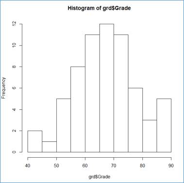
Not bad for a simple command. Notice that a histogram is a column chart in which there are no gaps between the rectangular columns. The interval limits are shown on the X-Axis and the frequency values —along the Y-Axis, representing the by the columns' height.
Notice that this is a basic (default) setup. Only the sample is supplied to the hist() function.
R applied m=10 class intervals starting at c0 = 40 and ending at cm=90. The class width of 5 (w = 5).
Except of c= 40, our settings are different:
m=8
w = 6.5
c0 = 40
cm= 92
Let's apply our settings to the histogram, dress up the column chart (histogram) by adding the [absolute] frequencies right above the chart's columns, and customize the X-Axis lables.
> hist(grd$Grade, breaks=bin, axes=FALSE, labels=TRUE)
> axis(side=1, at=bin)
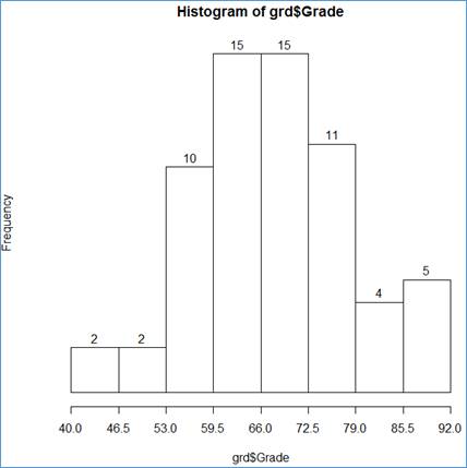
Here are the ingredients of the two statements:
grd$Grade - the data source;
breaks=bin - the class interval (bin) limits;
axes=FALSE - do not show the axes;
labels=TRUE - show the labels above the rectangular columns (the values for the frequency counts)
axis(side=1, at=bin)- add the X-Axis (side=1), using he bin limits (at=bin).
One more enhancement: the chart tittles:
> hist(grd$Grade, breaks=bin, axes = FALSE, labels=TRUE, main="Frequency Distribution of Grades", xlab="Grade", ylab="Absolute Frequency")
> axis(side=1, at=bin)
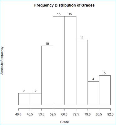
We have added the following chart components:
main="Frequency Distribution of Grades" - the chart [main] title;
xlab="Grade" - the X-axis title
ylab="Absolute Frequency" - the Y-axis title.
This end section "4 Getting a Frequency Distribution for a Quantitative Dataset ".
We already know how to develop a histogram. Let’s try it again with another data set.
Import dataset MV_Houses from workbook Chapter2.xlsx into R as table mvh (this is based on the example shown in the book, on page 40). Apply the steps shown in section 1 - Getting a Dataset from Excel to R.
. . .
> mvhp = read.table(file="clipboard", sep ="\t", header=TRUE)
. . .
Enter:
> head(mvhp)
HousePrice
1 430
2 520
3 460
4 475
5 670
6 521
to show a few top members of the dataset, including the header. This is a numeric sample, stored as one column (HousePrice) in R table mvhp.
Show a histogram:
> hist_mvhp = hist(mvhp$HousePrice, breaks=5, main="Histogram", xlab="House Price ($1K)")
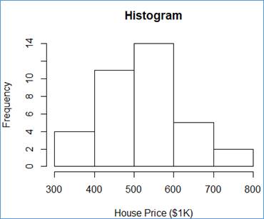
The hist() function does well. It takes the input dataset (here mvh$HousePrice), the number of class intervals (breaks=5), the chart title (main="Histogram"), and the X-Axis title (xlab="House Price ($1K)") and it does the magic! For each class, interval generated internally, R shows the frequency value as a vertical bar.
By now, you must have realized that a column of an R table is retrieved by giving the table name (here mvh), followed by the dollar sign ($), and followed by the column name (here HousePrice). You also could have noticed that strings are delimited in R by single quotes (e.g. '\n') or by double quotes (e.g. "Histogram").
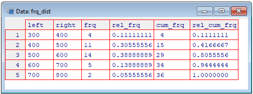
In the previous section, we learned how to develop a frequency distribution table from a one dimensional array of data (from a vector), using the cut() function and a few data frame operations. The histogram, show above, uses the frequencies that are calculated internally and used to determine the height of the chart's columns. There is a way to get the basic components of the frequency table from the histogram object (here hist_mvhp). The following R statements show how to construct the fully blown frequency distribution of HoursePrice sample:
> bin_lim = hist_mvhp$breaks
[1] 300 400 500 600 700 800
> abs_frq = hist_mvhp$counts
[1] 4 11 14 5 2
> m = length(abs_frq)
> m
[1] 5
Notice that the number of the breaks is larger by 1 than the number of counts. Again, the breaks define intervals so for 5 intervals, 6 numbers are needed to define the limits of the intervals.
Sample size:
> n = length(mvhp$HousePrice)
> n
[1] 36
The left the right limits of the intervals:
> left_lim = bin_lim[1:m]
> left_lim
[1] 300 400 500 600 700
> right_lim = bin_lim[2:(m+1)]
> right_lim
[1] 400 500 600 700 800
The relative frequencies:
> rel_frq = abs_frq/n
> rel_frq
[1] 0.11111111 0.30555556 0.38888889 0.13888889 0.05555556
The cumulative frequencies:
> cum_frq = cumsum(abs_frq)
> cum_frq
[1] 4 15 29 34 36
The relative-cumulative frequencies:
> rel_cum_frq = cumsum(rel_frq)
> rel_cum_frq
[1] 0.1111111 0.4166667 0.8055556 0.9444444 1.0000000
We are now ready to construct the frequency distribution table as a data frame:
> frq_dist = data.frame(left=left_lim, right=right_lim, frq=abs_frq, rel_frq, cum_frq, rel_cum_frq)
> frq_dist
left right frq rel_frq cum_frq rel_cum_frq
1 300 400 4 0.11111111 4 0.1111111
2 400 500 11 0.30555556 15 0.4166667
3 500 600 14 0.38888889 29 0.8055556
4 600 700 5 0.13888889 34 0.9444444
5 700 800 2 0.05555556 36 1.0000000
We can also show the table as a grid (spreadsheet), using the View() function.
> View(frq_dist)
This end section "5 Drawing a Histogram".
Import dataset Polygon from workbook Chapter2.xls into R as table plgn (page 40). Again, apply the instruction shown in section 1 - Getting a Dataset from Excel to R.
. . .
> plgn = read.table(file="clipboard", sep ="\t", header=TRUE)
. . .
This table consist of three columns. Show the table:
> plgn
classes x y
1 Lower 250 0.00
2 300-400 350 0.11
3 400-500 450 0.31
4 500-600 550 0.39
5 600-700 650 0.14
6 700-800 750 0.06
7 Upper 850 0.00
Now, draw a scatter diagram.
> plot(plgn$y ~ plgn$x, ylab="Relative Frequency", xlab="House Price ($1K)")
The plot() function does great job. It takes the two input columns (y and x) from table (plgn), the the Y-Axis title (ylab="Relative Frequency"), the the X-Axis title (xlab="House Price ($1K)") and it does the magic again!
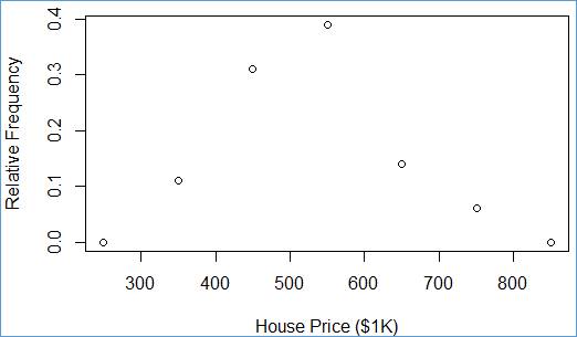
Each pair (x,y) is shown as a single point within a rectangular are. The y values have the vertical coordinates (along the Y-Axis) and x value have the horizontal coordinates (along the X-Axis).
Notation plgn$y ~
plgn$x can be read as plgn$y in
terms of plgn$x, or
as
plgn$y vs. plgn$x.
This end section "6 Drawing a Scatter Diagram ".
In order to get a polygon, we can reuse the scatter diagram. All we need is to add lines, connecting the scatter points. R has a handy statement to this end:
> lines(plgn$y ~ plgn$x)
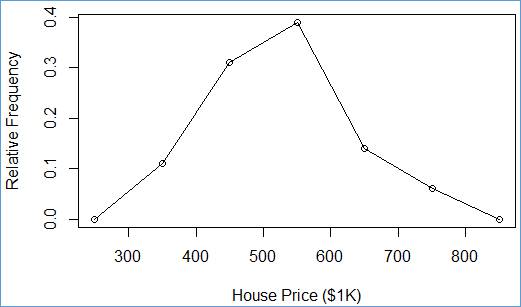
Connect point (250, 0.00) with point (350 0.11), next with point (450 0.31), etc.
This end section "7 Drawing a Polygon".
Import table Ogive from workbook Chapter2.xlsx into R as table ogv (page 40). Apply the steps shown in section 1 - Getting a Dataset from Excel to R.
. . .
> ogv = read.table(file="clipboard", sep ="\t", header=TRUE)
. . .
Plot the ogive as a polygon.
> plot(ogv$y ~ ogv$x, ylab="Cumulative Frequency", xlab="House Price ($1K)")
> lines(ogv$y ~ ogv$x)
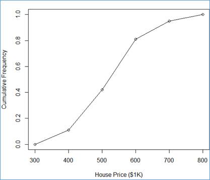
This end section "8 Drawing an Ogive ".
First try the R's stem() function on a simple dataset, consisting of a few numbers. The following dataset, named as ds, is created, using function c():
> ds = c(12,18,21,25,26,27,29,30,31,37)
> stem(ds)
The decimal point is 1 digit(s) to the right of the |
1 | 28
2 | 15679
3 | 017
The numbers before the vertical bar, |, (stems) are tens (the leftmost digits) and the numbers to the right of the bar are the digits (leafs). For example 12 and 18 are shown together as 1 | 28. Numbers 21, 25, 26, 27, 29 are shown together as 2 | 15679. Finally, numbers 30, 31, 37 are shown together as 3 | 017.
Let's try again the dataset set, mvh, from section 5 Drawing a Histogram. If necessary acquire the dataset again. Let's first show the dataset sorted in ascending order:
> sort(mvh$HousePrice)
[1] 330 350 370 399 412 417 425 430 430 430 440 445 460 460 475 520 521 521 525 525
[21] 530 533 537 538 540 555 560 575 588 630 660 669 670 670 702 735
Now, get the stem & leaf (S & L) diagram.
> stem(mvh$HousePrice)
The decimal point is 2 digit(s) to the right of the |
3 | 3
3 | 57
4 | 01233334
4 | 5668
5 | 2223333444
5 | 6689
6 | 3
6 | 6777
7 | 04
This mapping of the numbers is a little more complicated. Since the numbers are larger, some precision is lost. Technically, all the numbers are divided by 10 and rounded to an integer:
> hp = sort(mvh$HousePrice)
> hpr = round(hp/10,0)
> hpr
[1] 33 35 37 40 41 42 42 43 43 43 44 44 46 46 48 52 52 52 52 52 53 53 54
[24] 54 54 56 56 58 59 63 66 67 67 67 70 74
Now, the mapping is clearer. Each
line shows numbers from intervals (bins):
[30,35),
[35,40), [40,45), [45,50), [50,55), [55,60), [60,65), [65,70), [70,75)
where the left limits are inclusive and the right limits are exclusive.
Typically, the square brackets indicate an inclusive membership and the regular
parentheses—and exclusive membership.
Number 33 goes into the first bin, [30,35), as 3 | 3. Numbers 35 and 37 go into the second bin, [35,40), as 3 | 37, etc.
Let's try a similar effect by means of a frequency distribution. Let’s first set the class interval limits, breaks:
> br = seq(30, 75, 5)
> br
[1] 30 35 40 45 50 55 60 65 70 75
Next, let's generate the histogram with exclusive upper limits, based on the hpr dataset:
> h = hist(hpr, breaks=br, right=FALSE)
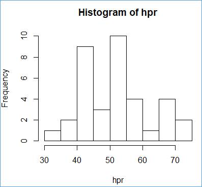
We can read the frequencies from the histogram, but it is easier the show them as explicit numbers:
> h$counts
[1] 1 2 9 3 10 4 1 4 2
These counts are very close to the counts of digits on the right side bar in the stem & leaf diagram:
3 | 3
3 | 57
4 | 01233334
4 | 5668
5 | 2223333444
5 | 6689
6 | 3
6 | 6777
7 | 04
However the stem & leaf diagram count are not the same (1,2,8,4,10,4,1,4,2). The difference is at the third position. The histogram reports 9 but the third line of the stem & leaf diagram shows 8 digits (01233334). This puzzle is hard to explain. My guess is that the stem & leaf procedure uses a the "popular" rounding scheme (numbers ending with .5 are rounded up) whereas the explicit R rounding operations utilize the "round to even" scheme. In our example, the culprit is number 445. The stem & leaf procedure allocates this number (divided by 10 and rounded to an integer) to interval [45,50). It shows up on the fourth line of the diagram as 5 (in 4 | 5668). Evidently for stem & leaf, round(445/10,0) = 45. If we check this expression directly in R, we will get 44.
Let's put it all together into a data frame. We first need to capture the S & L diagram as a string:
> sld = capture.output( stem(mvh$HousePrice) )
> sld
[1] "" " The decimal point is 2 digit(s) to the right of the |"
[3] "" " 3 | 3"
[5] " 3 | 57" " 4 | 01233334"
[7] " 4 | 5668" " 5 | 2223333444"
[9] " 5 | 6689" " 6 | 3"
[11] " 6 | 6777" " 7 | 04"
[13] ""
Let’s ignore the first 3 and the last elements and trim the strings (get rid of the leading/trailing white spaces).
> sld = trimws(sld[4:12])
Add sld to a data frame, left justified:
> frq = data.frame(stem_and_leaf=sld)
> frq = format(frq, justify='left')
> frq
stem_and_leaf
1 3 | 57
2 4 | 01233334
3 4 | 5668
4 5 | 2223333444
5 5 | 6689
6 6 | 3
7 6 | 6777
8 7 | 04
Let's add the counts of the right-hand side digits, the bin (interval) limits and the counts from the histogram.
> frq$sld_cnt = nchar(sld)-4
> frq$left = br[1:length(br)-1]
> frq$right = br[2:length(br)]
> frq$hist_cnt = h$counts
Now we can see the S & L and histogram results side-by-side.
> frq
stem_and_leaf sld_cnt left right hist_cnt
1 3 | 3 1 30 35 1
2 3 | 57 2 35 40 2
3 4 | 01233334 8 40 45 9
4 4 | 5668 4 45 50 3
5 5 | 2223333444 10 50 55 10
6 5 | 6689 4 55 60 4
7 6 | 3 1 60 65 1
8 6 | 6777 4 65 70 4
9 7 | 04 2 70 75 2
We can now see the difference between the S & L counts, sld_cnt, and histogram counts, hist_cnt (see row number 3).
This end section "9 Printing Stem & Leaf" and the entire R instruction for topic "Tabular and Graphical Data Presentation"|.